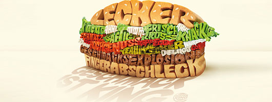
 |
| Ever thought which is the hardest job for graphic designers? Let me…It is to effectively visualize a concept into a single image. This is the exact requirement in creating a powerful print ad for newspaper, magazine or billboards. A print ad copy consists of two elements: visual imagery and typography. Although a picture is worth a thousand words, but the power of words cannot be underestimated. And the best way to illustrate words is through effective use of typography. |
Challenges for Graphic Designers in Print Ads:Creating print ads is quiet a challenging job for the graphic designers. There are a few reasons that cause the making of print ads a little tricky, e.g:
In order to get a better understanding of how typography serves the effectiveness to print ads, let us take a look at some of the brilliant ads. For your understanding and inspiration, I have collected 22 creative typographic print ads. |
Absa Bank |
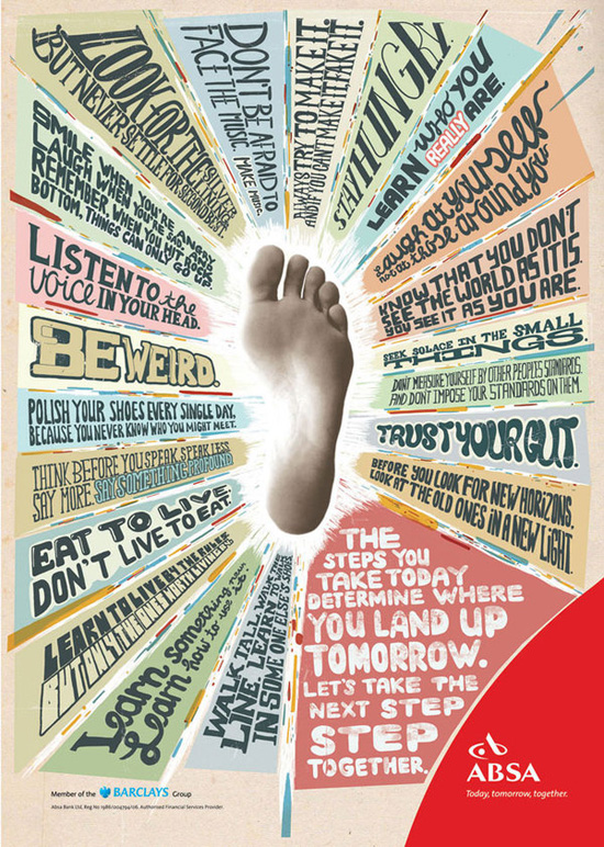 |
BMW is joy |
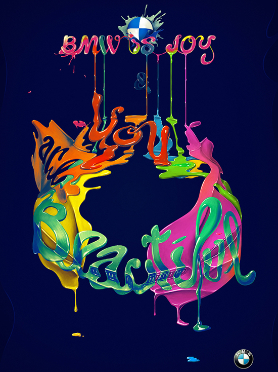 |
Brizo |
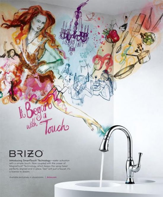 |
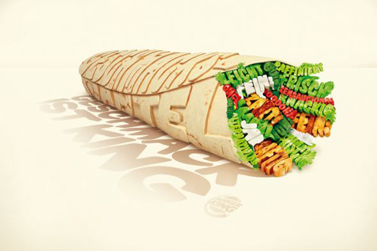
Burger King: Wrap |
 |
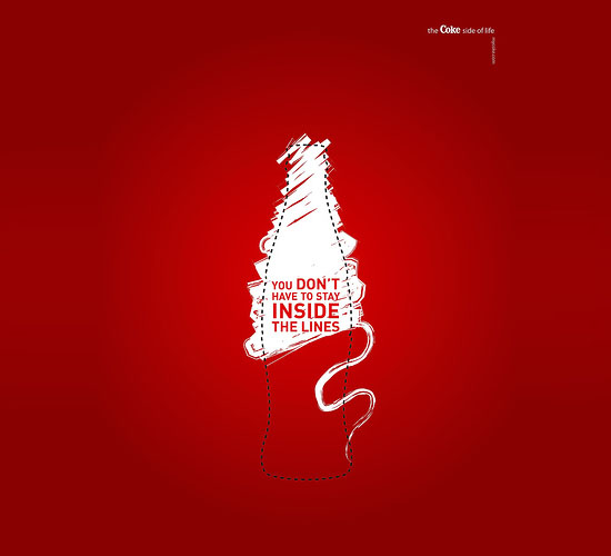
You Don’t have to stay inside the lines |
 |
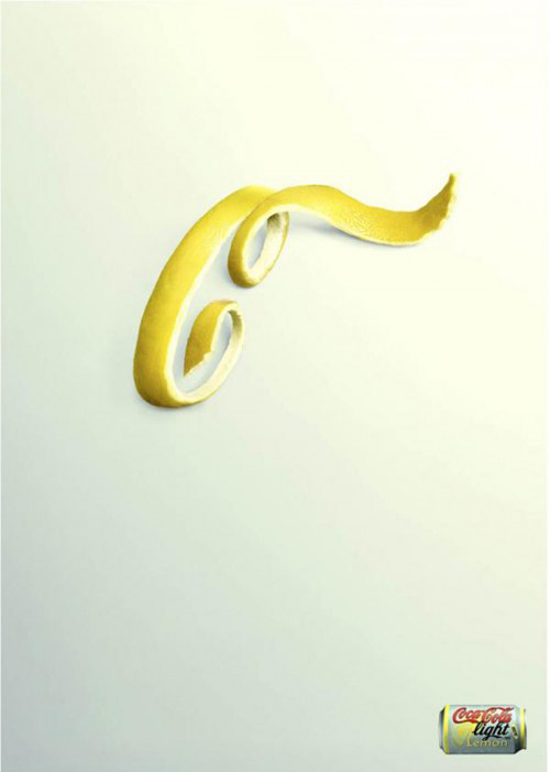
Coca Cola |
 |
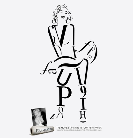
Folha de S. Paulo newspaper: Monroe |
 |
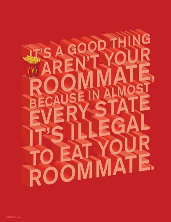
McDonald’s: Room Mate |
 |
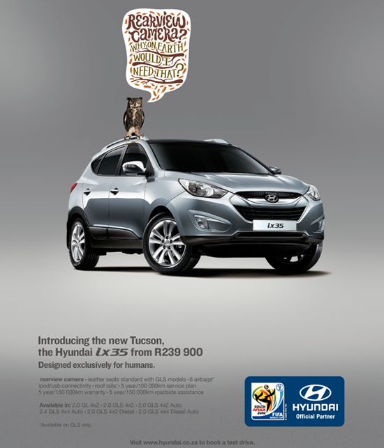
Hyundai – Designed for Humans |
 |
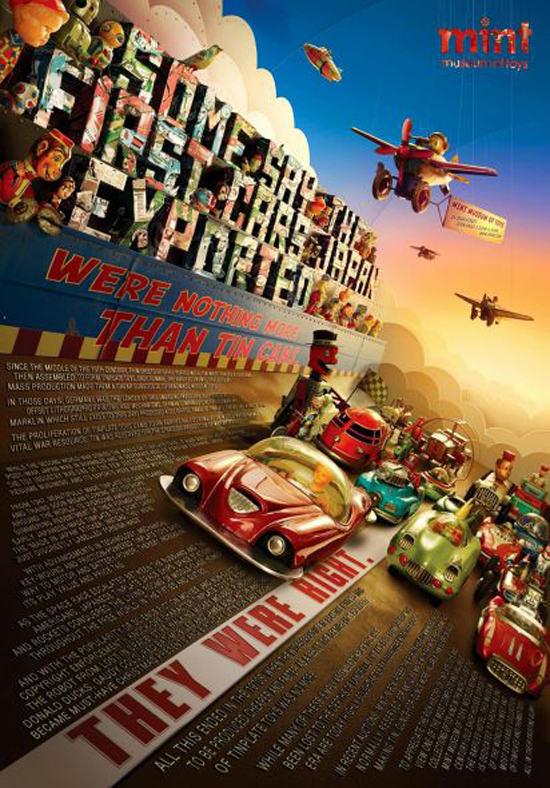
Mint Museum of Toys: Tin Toys |
 |
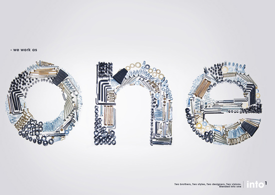
into1 |
 |
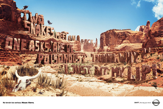
Nissan Xterra Jokes |
 |
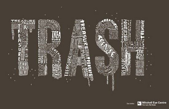
Mitchell Eye Centre: Trash |
 |
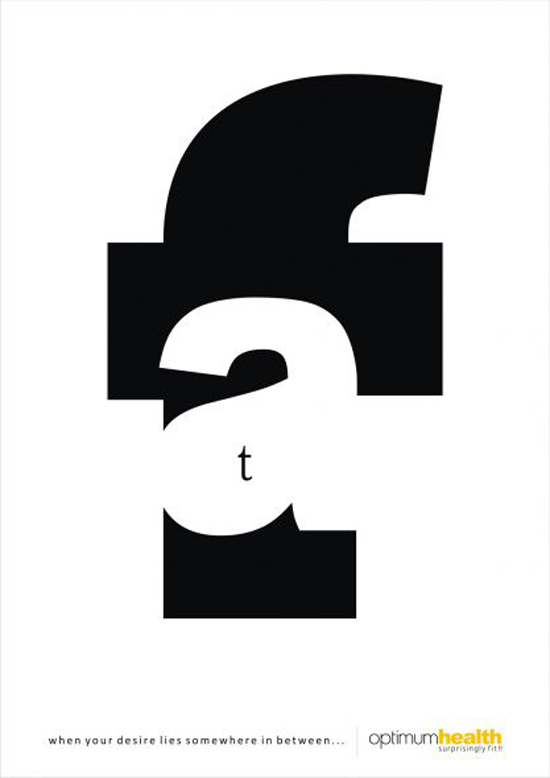
Optimum health gym: Fat |
 |
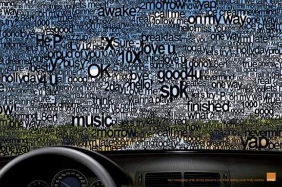
Orange – SMS |
 |
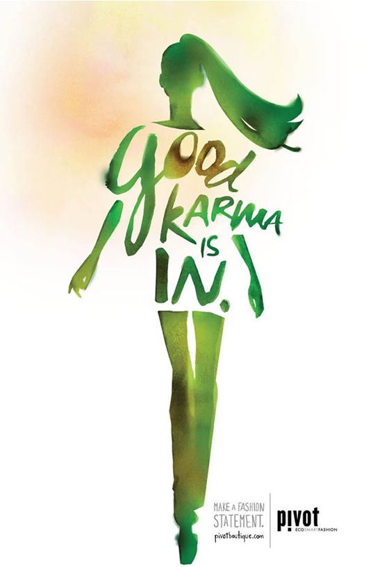
Pivot Boutique Karma |
 |
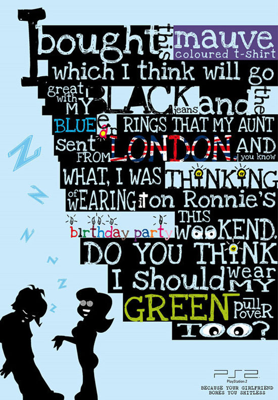
PlayStation 2: Girlfriend |
 |
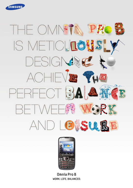
Samsung Omnia |
 |
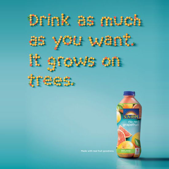
Sun-Rype: Trees |
 |
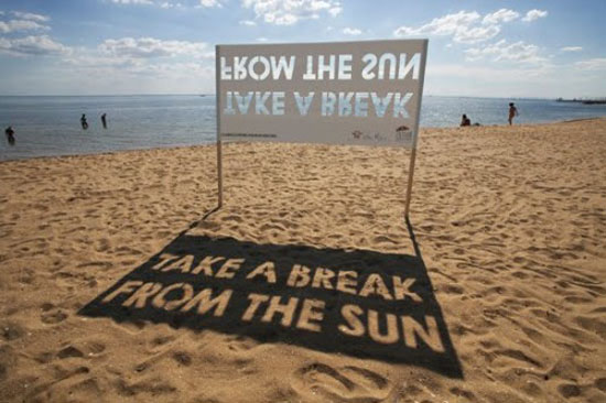
Take a break from the Sun |
 |
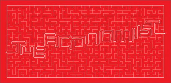
The Economist : maze |
 |
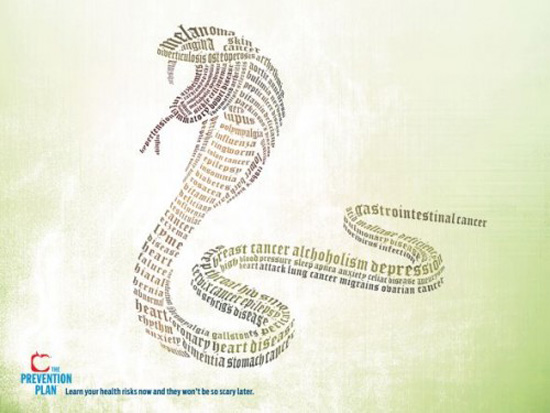
The Prevention Plan |
 |
Contect US
For Any kind of Graphic Design and adds Contact US
rockjone@gmail.com
Wednesday, December 1, 2010
22 Cool Typography Print Ads – Pictures that speak out!
Subscribe to:
Post Comments (Atom)

No comments:
Post a Comment