Contect US

For Any kind of Graphic Design and adds Contact US rockjone@gmail.com

Friday, June 10, 2011

The State of Webfont Quality from a Type Designer’s View

The rendering issue, at least at text sizes, is not going to go away anytime soon. As it’s been pointed out, the naivety of some designers, coupled with the marketing motivations of webfont services and distributors, does not bode well for the readership. The bandwagon has left, with everyone on board, but not realizing it’s missing a wheel.

[Editor’s note: Ross initially posted this text as a comment but I felt it required the space and prominence of a new post. — SC]

Some of the following simply reiterates what Stephen has already observed, but I think it is worth reinforcing from a slightly different perspective.

Firstly, let me address the statement:

Font buyers rely on providers more than ever before. Those who provide quality and transparency will lead this new market and medium.

I certainly hope this will be the case soon. Currently, providers use a few approaches to address the quality issue. One approach is to leave the optimization up to the foundry or licensing designer. This is obviously the least expensive and most profitable approach in the short term — profitable for the third party provider, that is, probably not for the smaller foundry. Another approach is to develop some sort of “autohinting”. From what I’ve seen this is at best a stopgap that provides somewhat adequate results some of the time, and would be what I consider only a first step, perhaps suitable for fonts that you knew were only being used at larger sizes, or as a basis for manual improvements. If I could generalize, the main point of weakness is that most automated routines only recognize obvious features of glyph anatomy (eg. stems, and to a lesser degree vertical alignments) but are mostly incapable of recognizing relationships, which is a core principal of TrueType hinting; the rasterizer has to be explicitly instructed that the counter of an ‘e’ shouldn’t collapse and should have white inside of it, unless told otherwise using Delta instructions. Autohinting can only say there is a top stroke, a middle stroke, and a bottom stroke, and that the top and bottom are in alignment zones. In fact, it doesn’t really know that the middle stroke is in the “middle”, it just knows its a stroke, and it doesn’t know anything about the relationship between the top and bottom. And so on.

I see some mention of rendering quality — how one provider’s approach bests their competition — but I see little actual sensitivity to the quality. For the provider’s own websites, where they can chose the best option (one would hope they would, at least), they chose fonts which are not optimized and have obvious, easily remedied issues. Not the best advertising, but at least its truthful, I suppose.

Even with those who really do know better, you see rather odd examples. Stephen pointed out Monotype’s FontsLive site, which doesn’t show examples below 24px (ppms?).


Webfont at FontsLive.com with ClearType rendering.

On this page they are promoting the quality of their webfonts, but if you look at the first ClearType example, it very much looks like it is not even hinted (vis. 36px and below). It doesn’t surprise me that it isn’t hinted, but that they are using it as an exemplar of their webfonts. This illustrates a couple of the issues I already mentioned: the “provider” is pushing a service without adequately addressing quality issues, which in turn aren’t seen as affordable to the original foundry because the original foundry’s/designer’s slice of the pie doesn’t warrant the expense. So the complaint that they are only showing larger samples is a valid one. It’s a bit of a snow job, but in this case they can’t even pull that off because the problems manifest themselves even at display/headline sizes. (The second Copperplate example has the same problems.) Fortunately, their collection of fonts for text are well chosen because they are well hinted, but the distinction can be blurred, especially in cases where something that could be a “text” font is categorized as “headline” because its unhinted.

So now we have webfonts, and they’re spilling out into the wild faster than they really should. Well, actually, they aren’t really all webfonts, they’re just marketed as such. What are the discussions about quality taking place in foundries, distributors, and third party providers? What steps are they taking towards addressing the quality issues? Do they care? The one positive thing with webfont services is that the fonts are served, rather then installed, and so when a better quality version becomes available there isn’t some onerous install and upgrade procedure to deal with.

It also doesn’t help to skirt the issue by placing blame, or making excuses or predictions that are not demonstrably accurate. Saying its Microsoft’s fault because their rendering is “crappy” is specious. The (TrueType) rendering is fine, as long as the (TrueType) font has a suitable level of instructions. There are more fundamental reasons why MS have chosen to retain this relationship between the rasterizer and the font, some of which has to do with the global nature of their market. Whether or not Windows rendering is better then OSX rendering can be debated subjectively. This debate has no affect on the existing and near-future market that the font and design industries have to serve, where actual OS proportions should rule the decision-making process. Windows XP may well be anachronistic, but it so happens over 50% of users happen also to be anachronistic, and an additional 40% of people are using other flavors of “crappy” rendering systems. That’s approximately 90+% of users out there using “crappy” “anachronistic” software, and as suppliers of content to those systems we have to do the best we can.

The same goes for the argument that in a couple of years we will all have 300ppi screens. Well, maybe, but I wouldn’t count on it. We will have more high resolution devices (mostly mobile devices), but again we are looking at the bigger picture when producing content for the web. I won’t go into it in great detail, but it is considerably more difficult to manufacture say, a screen that is 70 square inches (such as a laptop) then it is to manufacture a screen that is 5 square inches (such as the iPhone). Manufacturers have to be able to produce volumes of screens at an attrition rate that does not impact efficiency (ie. if you have to chuck half the panels because they have dead pixels, it doesn’t make financial sense). This end of the industry doesn’t seem to move nearly as fast as the other components. Screen resolution has been nearly fixed for the last decade, with most devices hovering around the 100ppi mark (+/-10ppi). So this argument is fine, if you don’t mind not releasing any webfonts for the next 10 years (or however long it will take for high-res screens to be the norm) — otherwise you’re not really doing any good to our end customer’s experience.

Which brings us to the solution end of things.

I don’t think foundries realize yet the “damage” they’ve done by saturating the market with libraries full of fonts not-yet-ready-for-screen. [...] But nonetheless, type-designers, get busy with it! — Angus Shamal

Right. Easier said than done. There are only a handful of people on the planet who do TrueType hinting professionally. FontLab certainly has the basic tools available, if you know how to use them or are willing to learn. So that’s one hurdle. The other is time and/or money. Hiring a third party to do your hinting is an option if you can find someone with the time and if you can afford it. It is highly specialized and is priced accordingly. But the more basic issue — regardless of the form of the investment in hinting — is whether that investment translates to a reasonable return for the originating foundry or designer after all the distributors and “providers” have taken their cut. It seems to me a more coordinated effort may be a better option and that all parties involved carefully consider the quality of the product being released, and collectively find a solution to deal with the issue.

Ross Mills is a type designer and co-founder of Tiro Typeworks. He has been involved in the design and production of multilingual and specialist typefaces for Microsoft Corp., Linotype Library, Apple Computer, the Government of Nunavut and others.

How Graphic Designers can get a day off – 7 Wicked Excuses!!

Graphic Designers are humans and not computers…clients should realize this fact. We are not machines that can run for hours ‘n’ hours with the same pace and efficiency. Even machines need rest, so why we graphic designers are blankly refused when ask a day off?? But with a Hitler like boss, unrealistic deadlines or pitiless clients, how can one ask for a day off from work? This is because you know that if you ask for a day off, several taunts and criticism will be hurled at you by your boss (or clients in case of freelancers). So what effective excuses can help you escape the realms of workplace?

Before I start on today’s subject, let me clarify that my purpose here is not to encourage graphic designers to be irregular and often take sick leaves, neglecting their important tasks. But on the contrary, these excuses will convince even the cruelest of bosses and clients, for times when you are not in a working mood and have a dangerous deadline to meet. So, whenever any of the graphic designers want to beat the heat, try any of these 7 wickedly effective excuses.

1. Kill a relative – For the 9th time:

Kill a relative

The next time your merciless boss won’t allow you to take a leave, kill a relative of yours ;) Not literally (god forbid) just make him/her expire for a day or two. Or even better, use an already expired relative and pass them away again. Just call in at work and say “I can’t come to work today; my grandmother/grandfather expired last night.” But beware of not using the same person at the same workplace. It may work twice or thrice, if you’re lucky, as you may get caught deceasing the same relative.

2. Fake a Faint – Heat Stroke:

Fake faint

Now this excuse could be a little tricky to pull off since it’s a little difficult for graphic designers to be good actors. But faking a faint is an effective excuse to save yourself from an urgent presentation boss has asked for or a meeting where he will be asking for your work update. Just when you feel you’re not up to the mark, stand up from your seat and pretend to faint in front of your colleagues. No matter how strict a boss you inherit, he/she will have to send you home and you might end up getting a paid sick leave for multiple days.

3. Come Wearing Sunglasses – Red Eye Infection:

Wearing Sunglasses

Another neat trick to convince your boss for a day off is by coming to work wearing sunglasses. You don’t mean to impress your boss with your dashing looks here, but just a cover up for red eye infection. Tell your boss that you have caught a contagious eye virus but still you are at work to meet the deadline. Reluctantly, your manager will have to let you go and probably advise you to take the week off to recover. No matter which field you are working in, be it SEO services or Web Development, this trick will surely help if your job is to sit in front of the computer for hours.

4. Get your cousin Married – Twice in a month:

Married twice

Got a close relative that has reached the age of marriage? Then it’s time for you to arrange a fake wedding for them and get a day off from work. Call your boss (or client, in case you’re working freelance) and inform them that your brother/sister/cousin is getting married today and your presence is critical as they might get cold feet. But don’t even make the mistake of inviting the boss or client in courtesy even…it may spill the beans.

5. Food Poisoning – Critical Stage:

Food poison

One of the evil myths of graphic design is that its Child’s play. But the reality is that it’s not…we need a break from work as well. But you’re not getting a sick leave on a minor flu or cough? Then it’s time for you to use the more serious and grave excuse of food poisoning. At times, graphic designers are unable to finish off their projects within the deadline, maybe because of sheer procrastination. Now they must evade an angry boss or client with an excuse. Use the food poisoning reason to buy yourself a day or two off the work. Explain that your stomach is severely affected and might be in a critical state.

6. Fake a Mugging – LIVE:

fake mugging

One of the shrewdest of excuses for taking the day off is faking a mugging. Let me explain how this could be done in most realistic way…call your boss and keep a friend ready nearby to act like a mugger. While giving an explanation for being late, all of a sudden shout like you’re mugged and keep your mobile on so that your boss can hear the phony episode. After a while, call at work and explain the whole event in a gloomy and miserable voice. To win more pity, tell how you resisted the mugger and got hit on the head with the butt of a gun. Eventually, your boss will advise you to take the day off or maybe a week to recover from the ‘traumatic’ incident and the bump in your head.

7. Back Spasm – Work load:

Being graphic designers, majority of your work is accomplished on the PC. Spending too much time on the computer can cause back spasms and sore necks especially for workaholic graphic designers. A day before you want to a sick leave, show signs of a back pain and sore neck in front of your supervisor so that he recognizes your pain. Now it all depends on how you act it out, you will easily get a trouble free day of relaxation at home.

Become a 2012 Olympic Story Telling Designer

Become a 2012 Olympic Story Telling Designer

If you're new here, you may want to subscribe to my RSS feed or follow me on twitter. Thanks for visiting!

BT is currently working on a campaign to find story tellers for the 2012 Olympic and Paralympic Games. They are calling on designers, artists and writers who would be interested in creating imagery, stories, films etc to tell the stories of 2012. Selected designers and artists will have acess to a series of one-off events where they can meet other storytellers and ambassadors of the campaign.

From the website

“We want to find people that can tell the story of the build up to the London 2012 Olympic and Paralympic Games – and the Games themselves – in the most fun, colourful, and diverse way possible.

We hope that you will be inspired to tell your story, either by events happening in your life, locally, or nationally.

Along the way, there will also be the chance for our storytellers to experience the excitement that’s already building around London 2012.

You’ll be able to attend sporting and cultural events, and meet some of the people that are directly involved, from athletes to celebrities.

In addition, BT will be aiming to showcase some of your work online and even in the media.”

If you want to find out more go to

http://www.btlondon2012.co.uk
http://twitter.com/BTLondon2012
http://www.facebook.com/BTstorytellers

Olympic Story teller designer

Juicy Logo Design Ideas For Inspiration

Today we are featuring juicy logo design ideas and you can take our word for it–literally.

Logos are integral to many branding and marketing campaigns, thus, it is important to make them as relevant and fresh as possible. To many companies, images related to nature is the best way to go. Take the below logos for example. Logo designers found a way to incorporate fruits and crops into their design. After all, plants lend a sense of freshness and life to designs.

See how these fruit inspired logos make use of familiar shapes and vibrant colors to represent products and companies. In truth, it is very easy to convey your message with symbols as easily recognizable as these. Enjoy the post!

Floomba

floomba
By: s@ky
View Source

Watermelove

Watermelove
By: MDS
View Source

Tropicado

tropicado
By: logorado
View Source

Happy Apple

Happy Apple
By: Houston-we
View Source

Yellowmaze

Yellowmaze
By: revotype
View Source

TastyBerry

TastyBerry
By: logosprite
View Source

Marmelo Cocktails

Marmelo Cocktails
By: Matto
View Source

Bitter Love

Bitter Love
By: revotype
View Source

Amora Bureau

Amora Bureau
By: vitox
View Source

Bloofroot

Bloofroot
By: Printdevil
View Source

Little Swift Olives 2

Little Swift Olives 2
By: stefani smit
View Source

Pearanah

pearanah
By: DaveGraphics
View Source

Garden Family

By: badovsky
View Source

Frozen Fruits

Frozen Fruits
By: MDS
View Source

Amei


By: Betho
View Source

Kiwity

kiwity
By: subarroca
View Source

Cocokiwi

cocokiwi
By: KrystanS
View Source

Squit Fruit

Squit Fruit
By: Tamude
View Source

Zestfresh

Zestfresh
By: willfarrant
View Source

J&K Fresh

J&K Fresh
By: Tiffani Ink
View Source

Nature’s Touch

Nature's Touch
By: surfinglarrythelegend
View Source

FrootFreak

FrootFreak
By: wonk
View Source

Carrotape

Carrotape
By: iadadesign
View Source

Cherryce

Cherryce
By: MDS
View Source

Juicy

Juicy
By: Matto
View Source

bananbo.com

bananbo.com
By: MDS
View Source

StrawHeart

StrawHeart
By: HugSargatal
View Source

Strawcho

Strawcho
By: DeepBuriana
View Source

Citruswirl

citruswirl
By: KrystanS
View Source

MagicApricot

MagicApricot
By: voxsix
View Source

Froothie

Froothie
By: QINQ
View Source

Watermelon

Watermelon
By: DigitalOrange
View Source

Cherry Tunes

Cherry Tunes
By: KrystanS
View Source

Scientyfruit

scientyfruit
By: alterego
View Source

BIO tagged

BIO tagged
By: karloidd
View Source

Lemonaid

lemonaid
By: ImageryDesign
View Source

Cherry

Cherry
By: Houston-we
View Source

Monday, June 6, 2011

The Right Way To Properly Design & Execute A Landscaping Project Without Finish Up With A Large Mess.

The crucial particulars for gardening are the offering of plant life for being planted and the arranging of the garden layout. Some times, house owners decide to landscape their own personal lawns however they are at a loss concerning where to start because even when they already have the capacity to take care of plants and flowers, they don’t have the garden landscaping ideas needed to make it look fantastic. The tendency is that their work ends in randomly chosen and messily set flowers. Consequently, to help you get started with your designing, think about the next details which should be looked at in garden landscaping: 1. Choose what type of garden you wish to build at home and whenever possible, don’t choose formal landscapes as they are tough to sustain (unless you are employing personnel to take care of your grass). The balance of the characteristics in a formal landscaping project are usually now and then tough to preserve. At Landscapers Cardiff, we always ensure that these points ate followed. 2. Utilize geometrical designs including curves in your garden features. Amoeba-shaped flower beds and long and curvy pathways will prove to add excitement to your layout, but don’t forget to restrict the kind of shapes that you employ because lots of types of shapes could make your garden seem disorganized. 3. Pick the right flowers to fit in every one of the required places in your garden. And also consider the type of garden soil your garden has and also the microclimate. Fully understand also the sizes of the plant life and their maturity, and how quickly these kind of plants are growing since you might end up purchasing plants that need frequent trimming. Any good Cardiff Landscaper will make sure these mistakes are not made. 4. Highlight the architectural style of your property. Make sure that your home is not covered by trees and overgrown bushes. Together with the right landscaping design, the nice features of your own home will likely be featured. 5. Be sure to help make your garden lively with movements from plants and flowers, wild birds or butterflies. Plants that freely sway with the wind and flowers that catch the attention of wild birds and butterflies will add life to your garden. Without having these, your garden will look like a dull painting. At Landscaping cardiff, dynamic gardens are always a must in our work. Those are merely several of the significant garden landscaping concepts that can help you get cracking. As you can see, as soon as you get an idea, all other issues will just follow. And don’t forget that landscaping is not always pricey. You can also make it a long-term venture by working one portion of the garden at one time. But if you’ve got no time and you have some cash to spare, you can make use of skilled landscapers to help make your garden appear even more stunning and even more quickly also.

An Awesome Collection Of Flyer Design Inspiration

Flyers are used a lot to provide information for a limited time at a relatively low production cost and unlike brochures, they’re not sophisticated. However, designing a flyer is not easy at all. A good flyer as well as any form of advertising gets the message delivered to the person that sees it and using great typography, vivid colors and also a good copywriting you get that result.

In this article there are 42 flyer designs to help you with your inspiration when you’ll have a project like this one.

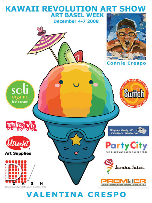
Kawaii Revolution UPP Flyer

Kawaii Revolution UPP Flyer

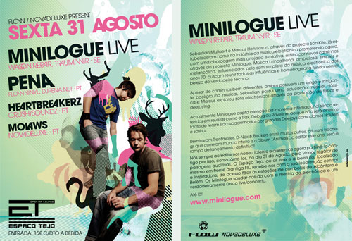
Minilogue Flyer

Minilogue Flyer

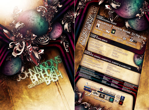
JOHN MOON’S FLYER

JOHN MOON'S FLYER

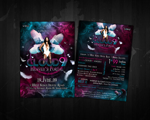
Cloud 9 Heaven’s Portal

Cloud 9 Heaven's portal flyer

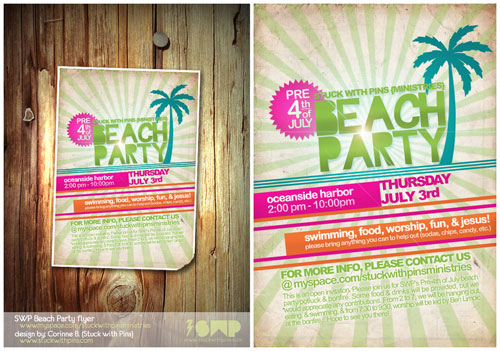
SWP Beach Party 08 flyer

SWP Beach Party 08 flyer

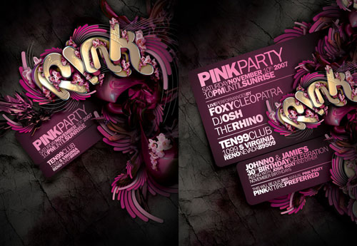
PINK PARTY FLYER

PINK PARTY FLYER

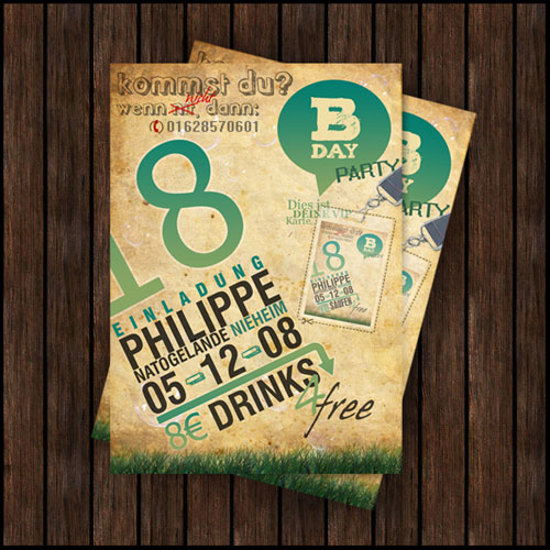
Philippe’s B-Day Flyer

Philippe's B-Day Flyer

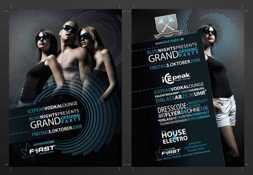
BLVD-Nights Flyer

BLVD-Nights Flyer

Vibetown Flyer 2

Vibetown Flyer 2

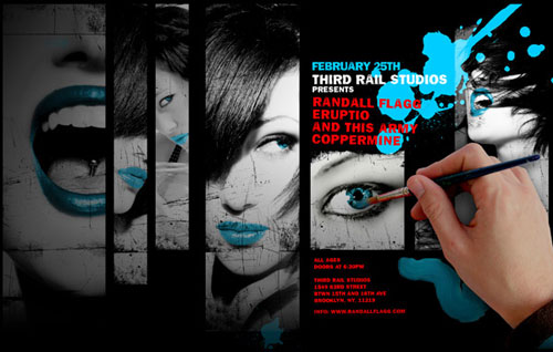
Randall Flagg Show Flyer 2-25

Randall Flagg Show Flyer 2-25

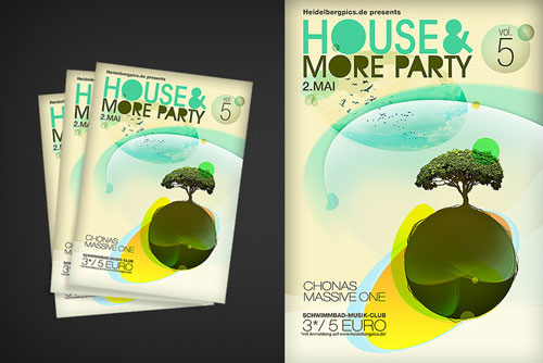
House flyer

house flyer

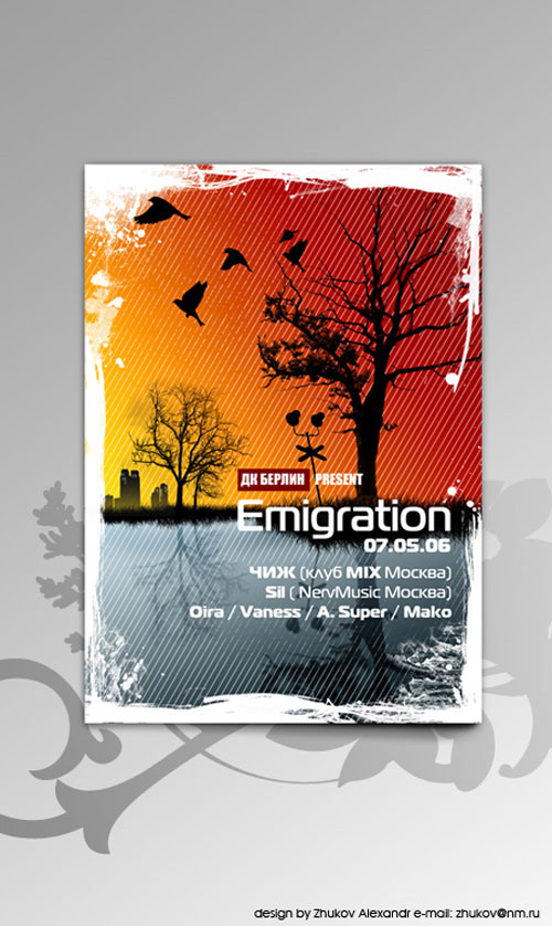
Emigration Flyer

Emigration Flyer

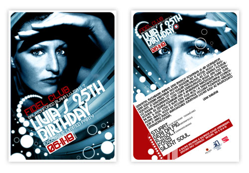
Fidel Club Flyer

Fidel Club Flyer

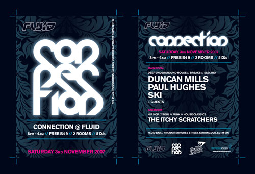
Connection Flyer

Connection Flyer

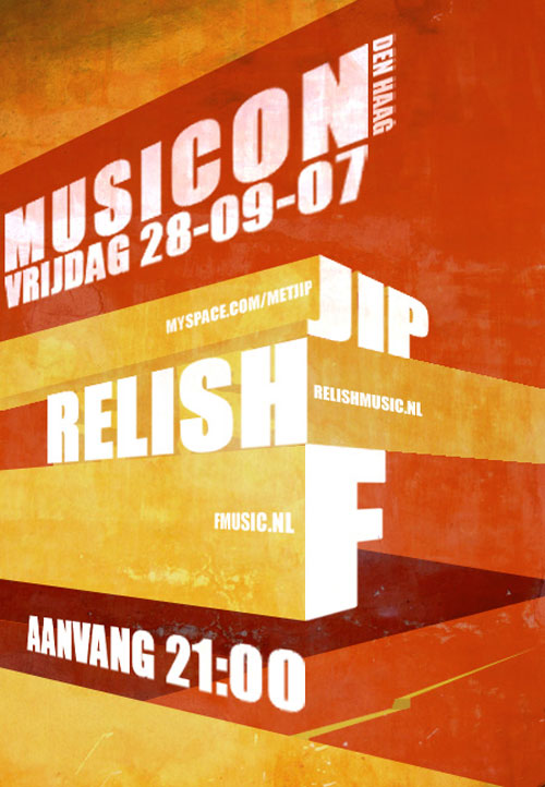
Another flyer

Another flyer

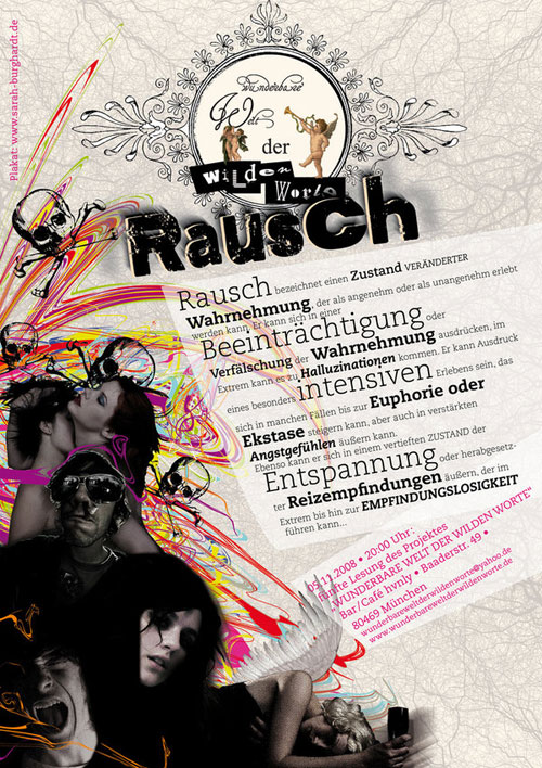
Rausch Flyer

Rausch Flyer

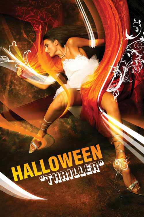
Halloween flyer

Halloween flyer

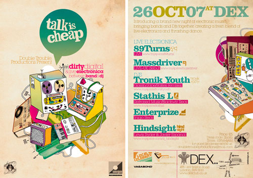
Talk Is Cheap Flyer

Talk Is Cheap Flyer

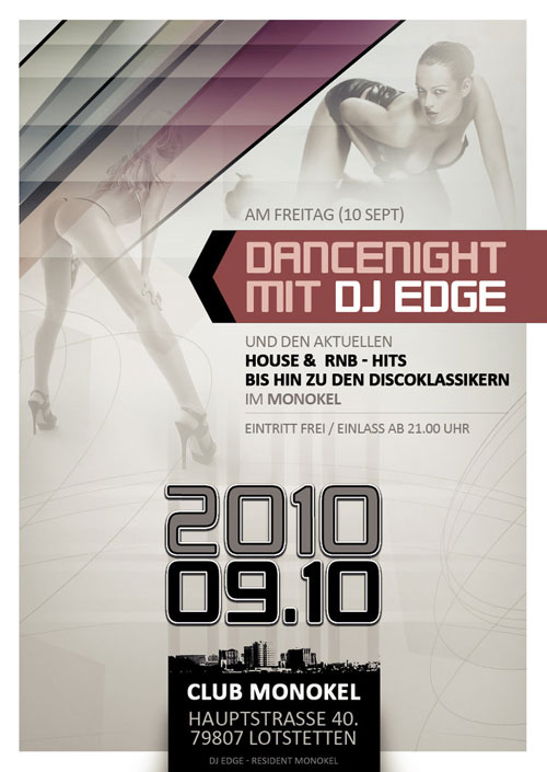
Dancenight Mit Dj Edge

Dancenight Mit Dj Edge

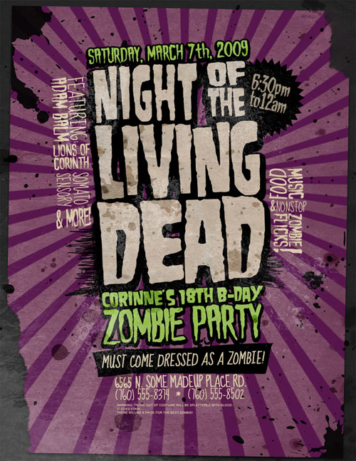
Flyer: Zombie Party

Flyer: Zombie Party

Flyer Electro Night

Flyer Electro Night

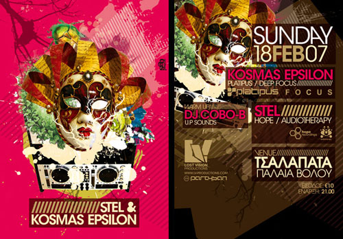
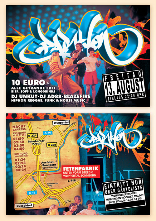
Stel + Kosmas Epsilon Flyer

Stel + Kosmas Epsilon Flyer

PartyOn Flyer

PartyOn Flyer

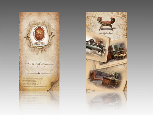
Attitude flyer 2

Attitude flyer 2

Party Flyer -PSD-

Party Flyer -PSD-

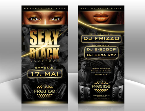
Sexy Black Party Flyer

Sexy Black Party Flyer

Baroque flyer

Baroque flyer

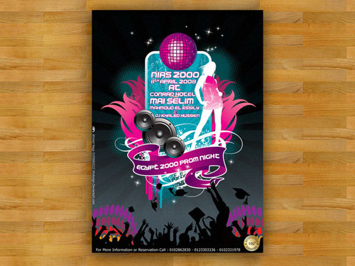
School PROM FLYER

School PROM FLYER

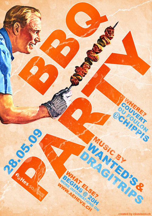
BBQ Party Flyer

BBQ Party Flyer

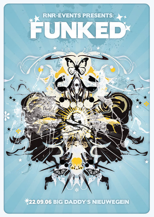
Funked Flyer

Funked Flyer

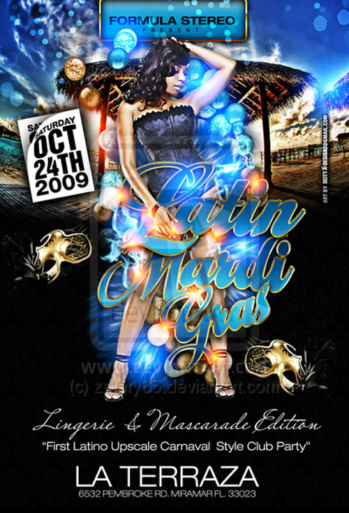
Latin Mardi Gras flyer Party

Latin Mardi Gras flyer Party

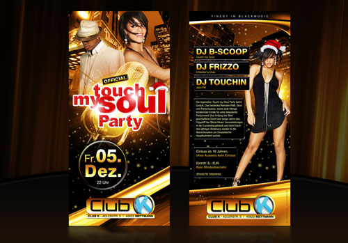
Touch my soul Flyer

Touch my soul Flyer

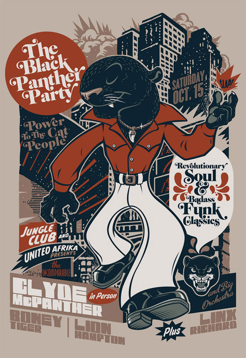
The Black Panther Party

The Black Panther Party

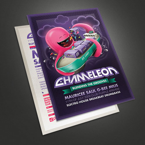
Chameleon – Octopus flyer

Chameleon - Octopus flyer

Disco Club Tropical Flyer

Disco Club Tropical Flyer

Disco Club Tropical Flyer 2

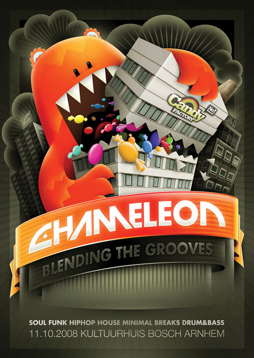
Chameleon – Candy factory flyer

Chameleon - Candy factory flyer

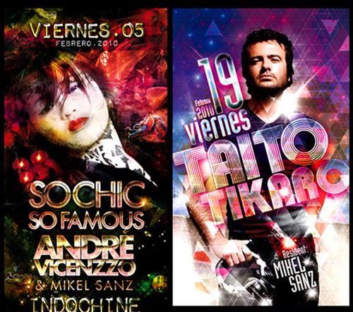
Flyers selection 1

Flyers selection 1

Beach Party Flyer

Beach Party Flyer

Flyer aelaat studio

flyer aelaat studio

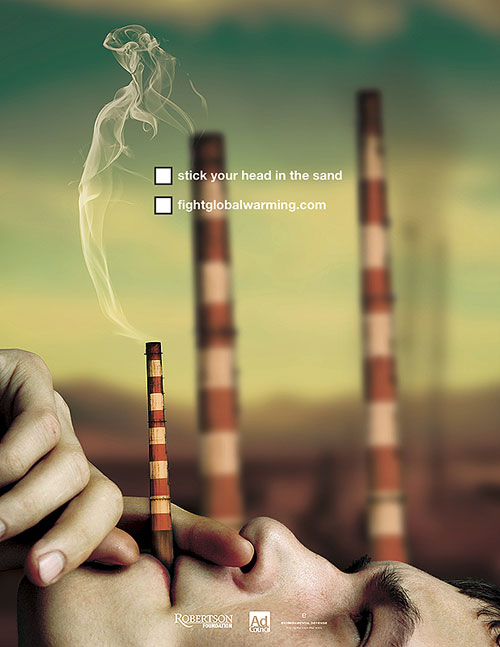
Fight Global Warming Flyer

Fight Global Warming Flyer