Contect US

For Any kind of Graphic Design and adds Contact US rockjone@gmail.com

Monday, May 30, 2011

123D is a free Windows app from Autodesk that helps do-it-yourselfers design and make their own custom goods, including electronics, lighting, car par

Whether you built a personal site from the ground up or oversee digital strategy for a huge corporation, many of us are managing a web presence these days.

There are millions of websites out there, and tracking how people are getting to your site and what’s performing well is a must for being competitive in the online market.

Google Analytics makes it easy for anyone managing a site to track and analyze this data. It’s a powerful, free tool that can answer a variety of questions for a wide range of users. Wondering which keywords resonate with visitors? Need insight on what design elements might be turning people away?

Here’s how you can start answering the website questions that have been keeping you awake at night.


Adding the Code


Once you set up your Google Analytics account, you’ll need to implement the code on your website.

Set up a profile for the site you’d like to track and the step-by-step process will generate a unique script that you can add. If you’re using a content management system or blogging platform like WordPress, Blogger or Tumblr, you only need to add the code once to your template or theme. The theme will propagate the code in every post and page you create.

If your site is custom-built, you’ll either need to implement the code on each page manually, or speak to your web developer about how the site generates content.

Copy the JavaScript code from Analytics and paste it just above the tag in your page or template. Adding this code will not affect the look of your site.


What You Can Measure


After you connect your site to Google Analytics, hit “View Report” on the initial screen. This will bring you to the main dashboard. In the left column, you’ll see the various types of data Google Analytics provides:

  • Visitors: This shows many things about the people coming to your site, including where they’re located geographically, what language they speak, how often they visit your site and what computers and browsers they use to get there.
  • Traffic Sources: Here you’ll find how people got to your site. You can track which sites link to your page or keywords people search to find you.
  • Content: This tab gives you insight into specific pages on your site. It can help answer questions about how people enter and exit your pages, as well as which ones are most popular.
  • Goals: If you’re aiming for established objectives, reports in the Goals tab will be helpful to you. Here you’ll find data about desired actions from users, including downloads, registrations and purchases.
  • Ecommerce: You’ll only need this tab if you’re selling items on your site as it houses all merchandise, transaction and revenue activity information.

These tabs contain subreports that provide insights about specific aspects of your site, including top content and visitor loyalty.

The information you choose to track depends on what curiosities you want to quell. Being in touch with keyword searches can help a site with text-heavy content to boost search rankings, while knowing which products convert best can inspire ecommerce sites to increase visibility of these items.

With Google Analytics, figuring out what you measure is the tough part. It’s how you measure that’s simple.


Setting Up the Dashboard


On the main dashboard, you’ll see a summary of your site’s data. You can customize the dashboard to show whichever reports you decide you want to see upfront. Just click on the type of report you want to see from the left column and hit “Add to Dashboard.” You can then position reports on the dashboard by dragging and dropping, or deleting ones you don’t want.

You can delve deeper into a data set by clicking “View Report” underneath the report graphic on your dashboard. This brings you to the full report on that topic.


Adjusting the Time Range


Be sure to adjust the date range in the upper right-hand corner before analyzing information from your reports. It defaults to a month-long range, ending the day prior to the day you’re viewing the report. (For example, on May 18, you’d see reports spanning April 17 to May 17.) Click on the date range box and a calendar will pop up. You can adjust it to track information quarterly, weekly, daily, or whatever timeframe works best for you.

If you want to compare date ranges, hit “Comparison” underneath the “Date Range” field. This will bring up a second calendar for you to adjust based on what time periods you want to consider, such as weekend to weekend or the first Tuesday of the month vs. the last Tuesday of the month.


Data Tables and Visualizations


Many of the reports in Google Analytics, such as pageviews and conversion rates, contain linear graphs that present data for the topic and date range you’ve selected. When mousing over the dots on the line, you’ll see measurements for that day, week or hour.

You can change the metric you want to visualize by clicking the tab above the graph on the left. Here you’ll also have the option to compare two metrics against each other. When you’re not comparing date ranges, you can compare against the site average. This is particularly helpful if you’ve laid out goals, as you can compare site activity to conversion goals. When comparing, a second line (gray) will appear for the variable over the graph with the original metric line (blue), making it easy to see how you’re stacking up.

Beneath the graph, you’ll see more data laid out with summaries and scorecards prominently displaying important overall metrics, such as pages per visit and time on site. Most reports have three different tabs in the top left above the scorecards: Site Usage, Goal Conversion and Ecommerce.

More granular measurements of these data sets can be found in a table below. You can visualize the table in a pie chart or a bar graph by clicking the icons just above and to the right of the scorecards. Table information can be sorted in ascending or descending order by clicking on the column heading you want to reorganize. To increase or decrease the number of results displayed, click the “Show Rows” drop down menu at the bottom right of the report. The default is 10 and you can show up to 500 results per page.

You can also refine data with the “Find Source” box at the bottom left of the report. Enter keywords relevant to your search such as “source” or “keyword” and select “containing” or “excluding” to reveal more specific information.

If you’re unsure of what a specific measurement means, click the question mark next to it and an explanation bubble will pop up.

Windows App for DIYers Helps You Design & Build Cool Stuff

123D is a free Windows app from Autodesk that helps do-it-yourselfers design and make their own custom goods, including electronics, lighting, car parts, furniture and much more.

Although the app (which is on the Ponoko Personal Factory platform) is based on the same Autodesk technology used by engineers around the world, 123D lets you start with simple shapes and then edit them into more complex 3D forms.

The apps also gives users access to free 3D models, supporting parts, props, backgrounds and photos, which are helpful for quickly and easily getting projects started and putting on the finishing touches.

Perhaps the most exciting part of the app, however, is that it also provides fabrication options for makers. Autodesk partners can help users find tools to make projects at home, or fabrication can be done by the partners themselves.

123D is the first app created for Ponoko’s App Gateway. The company is trying to get more devs to create what it calls “making apps” — apps that will help crafters, hackers, tinkerers and other DIYers create cool stuff of their own design.

Hello Bar Sees 200M Installs to Help Japan

The makers of the Hello Bar, a dead-simple web design feature anyone can use on a site, have told Mashable that the company has served more than 200 million Hello Bars to help Japan.

The company conservatively estimates the tool helped raise $2 million for the Red Cross and other organizations working to help the Japanese people recover from a string of natural and nuclear disasters.

“We had some heavy hitters like the Seattle Seahawks using it,” writes Chuck Longanecker of digitaltelepathy, the web shop that created the Hello Bar as well as SlideDeck, the popular JavaScript image slider.

Longanecker said of consumers’ use of the Hello Bar during the Japan crises, “It’s inspired us to continue to support causes with out platform.”

Other big news includes the official launch of the tool’s Pro version. All users will get a free 2-week trial of Hello Bar Pro, after which the upgrade will cost $25 per month.

In addition to the tool’s usual features (a slim bar that sits atop your site for as long as you tell it to, delivering customized text, links and design), Hello Bar Pro will also give users:

* A/B testing tools to see which text, links and colors are most effective
* Advanced statistics, including A/B results
* Dynamic Hello Bars that pull text and links from RSS feeds
* Up to 10 Hello Bars, all free of Hello Bar branding
* An always-on-top feature that keeps the Hello Bar in view during scrolling

If you don’t currently have Hello Bar access and would like to try it out, just go to the Hello Bar website and use the invite key mashable. That key will be good for the first 500 people.

Thursday, May 12, 2011

May Share 0diggsdigg Prepare Your Website for Future World Wide Web

Technology is changing at a rapid speed and it asks everyone to stay updated. If you are not up-to-date then your products are not addressing the need of modern era. Till date, most of us are working on HTML4 and CSS2 to develop their Websites. Have you seen anyone using iDEN or 1G-powered network for his/her cell phone? Have you seen any one working on Pentinum I or II processors? Do you still use a Pager to receive the messages? If not, then why are you using old web standards to design/develop your Website? In this article, we’ll discuss the possible future developments and what exactly you have to do.

What is the future of Web?

The future of Web lies in following 9 components.

  1. Latest Web Development Standards
  2. Portability
  3. Social Media
  4. Content Management Systems
  5. Applications
  6. Cloud Computing
  7. Dynamic User Interface
  8. Security
  9. Stay up-to-date
  10. Favor Open Source

Let us have a look why you need to follow above listed components.

Latest Web Development Standards

HTML5 and CSS3 are the latest trends. You can just ease up your work with both of them. Following are the benefits of using HTML5 and CSS3: -

  • Fast Streaming of Media Files
    The latest
  • Drawing
    The tag allows the developers integrating JavaScript codes very easily to draw dynamic animations, graphics, and diagrams on-the-fly.
  • Geo-location
    Before HTML5, the Web developers have to write big lines of scripting code to access the geo-location of the visitors or subscribers. HTML5 ease up this work for you with its native geo-location features.
  • Animation
    CSS3 allows one to create the 2D and 3D animations on your Website. Unlike Flash, these animations are lightweight and loads up instantly. You can also use the images to create the slideshow. Thus there is no need to get dependent upon Web Albums Sites for it.

Portability

The World Wide Web is becoming popular and its population is increasing rapidly. It is noteworthy that a large amount of population is accessing Internet through their portable devices like mobile and tablets. Number of Mobile Internet users is estimated to reach 134 million till 2013. Mobile/Tablet users open the Websites in their portable browsers. If a Website does not look good as per their screen size, they often leave it or close it instantly regardless of its usability and popularity. This is the reason all big brands and banks are coming up with the mobile version of their Websites.

It is the correct time to make your Website compatible with mobile devices and tablets. You can use Wireless Markup Language (WML) to convert your existing Website into a mobile version. Have a mobile version today and get more visitors.

Social Media

Everyone likes to be social, especially while being online. If you have not added the Social Media features to your Website then it means you are not providing good and optimum user experience. Each person likes to be special. You can make the visitors special by allowing them to login at your Website, liking the posts, leaving comments, reviews, opinions, see what their friends liked/recommended, chat with others, and so on.

Add the exciting options like Facebook Connect, Google Friend Connect, Facebook Like, Facebook Comments, Google Comments, Twitter Profile, Identi.ca, Google Ratings & Reviews etc. on your Website. And see a difference in visitors’ mood, their visits and Websites’ ranking.

Content Management System

Stop coding manually to create a Website, manage your content, and write manual code for future technologies integration! You can just use an online Content Management System either free or paid. The best options till date are Wordpress, Drupal, Joomla etc. These CMSs can setup your Website in minutes and allow you doing further modifications.

Applications

Applications, add-ons, extensions, and Mobile Apps are everywhere. Almost everyone likes them. The Mobile Apps allow users to browse quickly through the provided content. The Apps load much faster than the mobile version of your Website. If you’re running a blog then you can create a Mobile App showing the RSS updates. Similarly, you can create add-ons for the browsers like Google Chrome, Mozilla Firefox, and widgets for Opera. The tools to create Mobile Apps and Browser extensions are available for free. If you do not want to develop on your own, then you can search the market for the same.

Cloud Computing

If your Website is getting heavy traffic then you must handle it correctly. The dedicated cloud Web hosting is cheaper than other traditional methods and allows handling of massive traffic even at peak loads. You must adopt cloud-based programming techniques for developing your Website and software for it. This will not only save resources and reduce expenses but also give you ample amount of time to focus on other projects.

Dynamic User Interface

A must have feature for the future-enabled Website. The user interface must be dynamic and faster. Make use of Spry Tabbed Panels in your Website. Microsoft has developed the Metro UI based on it, take a peek at Microsoft.com.

Security

Keep your Website secured against any future threats. Make use of secure shell access, secure FTP, and HTTPS for your Website. If you’re running an e-commerce Website then obtain a certification from trusted verifiers like VeriSign, Thawte, PayPal, eBay, Microsoft, McAfee, Google Checkout etc.

Stay up-to-date

Each update of any software/hardware brings several fixes, security patches and improvements. If you are not using up-to-date techniques, software and hardware then it means you’re staying behind in the technology race and your products are not secured anymore. Update your application software, CMS, antivirus, FTP client, subscriptions, and Web standard periodically.

Favor Open Source

Do you think if an application is free then it has limited features? This is not true in all cases. The software registered under GNU Public License is available for free and trusted to use. See each browser such as Internet Explorer, Google Chrome; Opera etc. are available for free. Are you not using these browsers? Yes, because you trust them. Make use of open-source standards to develop your Website like PHP, MySQL, HTML5, CSS3, and CMS like Wordpress, Drupal, Joomla etc.

One should adopt a framework to achieve the latest Web and Technology standards to run with the time and stay ahead in the race of life and work. We suggest you to adopt latest web and technology standards that suit your needs and prepare your Website to perform well as more developments will continue to happen in the web world.

Wednesday, May 11, 2011

20 Interesting Logo Mash-Ups – Brand Parodies!

Who says graphic design isn’t fun? On the contrary, being a graphic and logo designer is quite a thrilling and entertaining profession in itself. Just last week, I managed to find some leisure time and decided on playing with famous corporate identities. The Idea came up when I thought of some major corporate mergers this year. I thought…why not visualize some other famous corporate mergers myself.

In under an hour of Photoshop manipulation and with some quick wit, I managed to create 20 side-splitting logo mash-ups. Besides the humorous aspect of my endeavor, these logo mergers will demonstrate how famous corporate identities would look after a merger. So, come along guys and enjoy these 20 imaginative logo mash-ups:

1. Audi + Disney = Audisney

Adidas & ask.com

2. 3M + McDonalds = 3McDonalds

Adidas & ask.com

3. BBC + CNN = BBCNN

Adidas & ask.com

4. Cadillac + Lacoste = Cadillacoste

Adidas & ask.com

5. CISCO + Colgate = CisColgate

Adidas & ask.com

6. FedEx + Exxon = FedExxon

Adidas & ask.com

7. Daihatsu + Subway = Daihatsubway

Adidas & ask.com

8. GAP + Apple = Gapple

Adidas & ask.com

9. L’oreal + Real Player = L’oreal Player

Adidas & ask.com

10. Google + Lego = Googlego

Adidas & ask.com

11. Mac + Accenture = Maccenture

Adidas & ask.com

12. Pepsi + Siemenes = Pepsiemens

Adidas & ask.com

13. Michelin + Intel = Michelintel

Adidas & ask.com

14. Nintendo + Dockers = Nintendockers

Adidas & ask.com

15. Nissan + Sayno = Nissanyo

Adidas & ask.com

16. Oracle + Levi’s = Oraclevis

Adidas & ask.com

17. Rolex + XBOX = RolexBOX

Adidas & ask.com

18. Shell + Shleter = Shelter

Adidas & ask.com

19. Twitter + Terminator = Twitterminator

Adidas & ask.com

20. Visa + SAP = VISAP

Adidas & ask.com
In the end, I also tried to experiment with my own GDB logo and found Blogger logo to be the best choice for the mash-up…I am sure you’ll like this one too:

Graphic Design Blog + Blogger = Graphic Design Blogger

Adidas & ask.com

Need Blog, Web or Graphic Design Help? SEO Help?

Since my switch to WordPress in December I have had suspicions that my SEO wasn’t set up correctly. When Google performed their latest PR update and my GPR went from a 0 to a n/a… I knew.

I have been trying to work on fixing it, but finally I gave up and put out an S.O.S. … I was stumped.

That’s when I found Jenny from Simple Mama Blog & Web Design. She has been very sweet with my ignorance. In less than an afternoon she had most of my problems fixed (we hope! waiting for one more update). Jenny knows a lot about SEO because, that’s what she does!

Take a look at some of her snapshots from her portfolio!

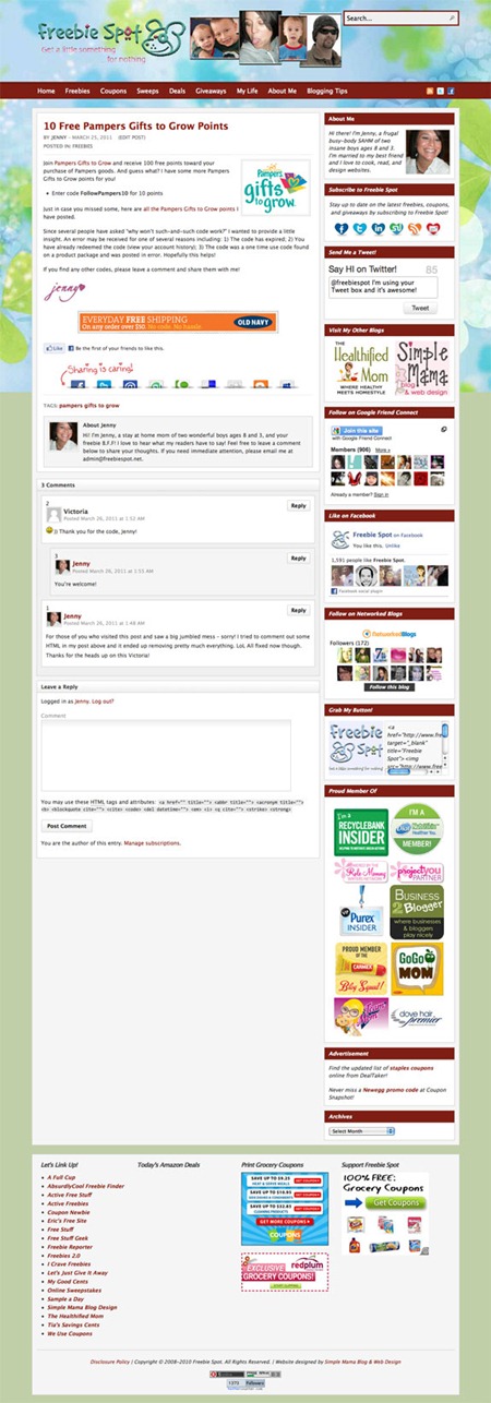
FreebieSpot-Post

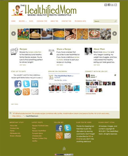
HealthifiedMom-Main

CoyoteCreek-Main

Wednesday, May 4, 2011

Beautiful Collection of May 2011 Calendar Wallpapers

As it is well known that desktop/mobile wallpapers are great sources of inspiration which gives you an amazing feeling, every time you look upon it. This creation of astonishing wallpapers goes throughout the year. As the month of May has been started, so we have decided to provide you some design inspirations related to the month and to let you store that inspiration with you in your desktop/mobile. Hence, this post features some outstanding calendar wallpapers of May2011. Let’s decorate your desktop for this month.

May 2011 Calender Wallpapers

A Look at the SlashThree Collective

What are the most important goals you’re attempting to achieve?

It’s safe to say the goals of the collective have changed significantly since its inception, and I suspect they will continue to do so in the years to come. As the collective matures, the tone of the group has become more and more serious. A good percentage of our artists are working as full time industry professionals at this point, so the focus of the collective has shifted in order to facilitate those changes. We are working to develop new avenues of exposure, sponsorship, and participation with high caliber contests and events.

A recent milestone was being offered the distinct honor of presenting at this years OFFF (Online Flash Film Festival) in Barcelona. It was both humbling and encouraging for the collective as a whole. I think for some of the artists it was also validation that the collective and their contributions to it aren’t going unnoticed. In a broad sense our main objective is to just keep doing what we do. Building friendships, improving our skills, and finding new ways to give back to the community that shows us so much love.


From The Deep Into The Sky by Sorin Bechira


Divine Boundaries by Wojciech Magierski


Fade by Marco Casalvieri


Ive Met Her Before by Ola Gien Rysamb


Meaning by Murat Pak