
What’s the difference between a good design and a great design?
When you sit down and start a new project, that should be one of the questions at the forefront of your concerns.
Yours is a quest to constantly outdo your own past work. To go further and genuinely become better at what you dorather than falling into complacency, stagnation, and eventually, obsolescence.
Unfortunately, the answer to the riddle of what makes a design great isn’t a simple, straightforward formula that you can apply to every design. There is no secret way of designing something that will suddenly make you a hero amongst your peers and lead to your work being featured on every CSS gallery on the web.
Instead of a quick, one-size-fits-all solution to becoming a great designer, this article will present a threefold response that arises from viewing design through three necessarily different perspectives: the designer, the client and the user.
The Designer’s Perspective
This one is my favorite. As designers, our ideal audience are those individuals who understand us the most because they are just like us.
We want to design for the kind of people that will drool over the beauty of our use of CSS3 no matter how impractical the implementation; people who will comment on the aesthetic quality of the textures, the richness of the color palette and the excellence of the typography in the design.
After all, compliments feel good and there is no niche more qualified to provide them than the design community.
As this site and many others prove on a daily basis, this is in fact a legitimate audience. There is money to be made catering to the interests of the world’s designers, and countless sites are designed specifically with this group in mind.
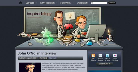
As an example, take the recent redesign of Inspiredology shown above. This is a site created by designers for designers. Consequently, it’s heavy on eye-candy. The header is a beautifully goofy piece of art that always grabs your attention for a few seconds no matter how many times you’ve seen it.
As you scroll around the page, you can see that the quality of the visual appeal is carried on throughout the design.
The difference between good and great design from the designer’s perspective is therefore simple: aesthetics. Put two websites in front of a professional designer, ask him to choose which is the best and chances are that you’ll see the prettier site chosen over the uglier alternative.
It’s simply the way we’re wired. Our knowledge of aesthetics isn’t something to be scoffed at — it’s what makes us valuable. If everyone could make something look beautiful on their own, we’d be out of a job. Attractive graphics have the unique ability to capture the attention of people who would otherwise be uninterested in taking the time to hear what it is you have to say.
However, possessing the ability to see past pure aesthetics is an important aspect to understanding truly great design. Which brings us to our next perspective: the client.
The Client’s Perspective
Unfortunately, not all designers can create primarily for the delight of other designers. In fact, only a tiny percentage of designers can enjoy this luxury. Most are forced to satisfy different types of people whose thought processes drastically differ from their own.
I used to spend my days working for a major marketing company designing dog food ads. Sounds fun, right? There was no one to ogle at my typography or compliment the complex layouts that I was forced to pull off in record time to meet deadlines; only a group of suits with bigger paychecks and zero design training who possessed expert knowledge of how to sell the product.
In this situation, focusing purely on aesthetics won’t garner you a single "great job" or "atta boy!" In fact, corporate advertising — be it print, web, or video — is infamous for an age old battle between creatives (the designer types) and marketers.
The creatives argue that customers will choose the product with the most attractive graphical representation.
Marketers counter by suggesting what customers really want is to have their demographic and psychographic needs addressed while forming a lasting connection with the brand (make-the-logo-bigger mentality).
This same dilemma carries out of corporate marketing offices and into the relationship between freelance designers and small business owners all over the world. The guy running the local auto shop doesn’t care if you win design awards for creating his website, he just wants it to be effective in driving customers into his store.
The difference between good design and great design from the client’s perspective is whether or not the product you’ve provided meets the goals that were originally presented. Though one of these goals is bound to be aesthetics, it is often the case that the final product is a less-attractive but more on-target version of what you originally presented.
As an example of a good client-focused design, consider the site below.
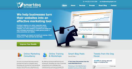
Here we see both perspectives at work. First of all, the designer has created a really great-looking site (not stunning or overly original, but attractive nonetheless). It’s bright, colorful, friendly and quite easy on the eyes. However, if you stop by the site you’ll really get a feel for how much information has been placed on the home page. This is undoubtedly a marketer at work (notice that it is in fact a marketing website).
Here the client needed to present a lot of information and the designer’s job was to do so in an attractive manner. Given complete control, the designer would’ve likely moved a lot of the text to another page — but ultimately the two sides worked together and were probably both forced to compromise a bit to create the finished product.
The User’s Perspective
This is where the ultimate goal of both marketing and design come together in either a harmonious or chaotic attempt to incite and/or facilitate a desired action. The difference between good and great design from the user’s perspective is that one paramount piece of the puzzle that trumps everything else.
When a design finally hits the real world, stereotypes go out the window. Real people don’t fit into the neat little boxes that we try to put them in. They’re complex, unpredictable and each one different than the next.
Some users will care a great deal about aesthetic appeal, others won’t give it a second thought. Some users will analyze every grammatical nuance while others will barely scan a few words.
In the realm of the web, the one thing that ties all your users together is whether or not the design is functional. From the perspective of the user, a great design is one that works. If they can jump on your site, locate the information they want and perform the actions they need to without getting confused, misdirected or frustrated — you’ve won them over.
As much as we designers love to criticize their profound lack of design, Google is the king of this category.
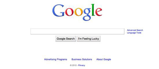
Whether or not you think Google’s strategy is appropriate, the fact is that they currently own 65.8% of the search market, with their competitors Yahoo! and Bing trailing behind at mere 17.1% and 11% respectively[1].
A main contributor to their rise to the top was the simplicity to which they clung to for so many years and are only just now starting to relax in response to those gaining competitors.
This example proves that most people want to use a search engine to do just that: search. And when you look at the iconic Google page, there is no mistaking how to go about this task.
Google users don’t want a bunch of superfluous art or lengthy marketing ploys to distract them, they want the search bar.
As crazy as it sounds, in the case of Google, great design can be attributed to the lack of design.
Bringing It All Together
From peering into the three unique perspectives of the major participants in the professional design world, we can create a picture of what great design really looks like.
To the designer, great design is beautiful design. A significant amount of effort must be placed into making the product attractive.
To the client, great design is effective. It must bring in customers and meet the goals put forth to the designer in the original brief.
Finally, to the user, great design is functional. It’s easy to read, easy to use and easy to get out of it what was promised.
It’s important to note that the lines between the three perspectives are not so clear-cut. Many marketers will care a great deal about aesthetics, many designers will hold effectiveness in high importance and many users will be keen enough to pay attention to all three variables.
Truly great design, then, is when these three perspectives are considered and implemented equally to create a final product that is beautiful, effective and functional.
Keep in mind that the product must be a synergistic realization of the three perspectives and not merely contain elements ideally suited for each. The design must be attractive enough to catch a user’s attention, the message strong enough to communicate effectively to the user and the functionality simple enough to cause the user to take action.
Example: Kaleidoscope
To see what great design looks like in practice, let’s look at an example of a site that’s gotten a lot of attention recently (for good reason). Below is a screenshot of a website for the Mac application, Kaleidoscope.
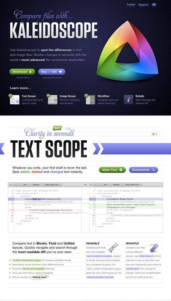
First, let’s think about the designer’s perspective. Is the site attractive? Absolutely! The colors and graphics are amazing, the typography is classy and the subtle animation in the logo (stop by the site to see it) is pure designer bait.
Further, the single-page site is broken up into five unique but cohesive sections, each with their own wonderfully attractive appeal (two of these sections are shown above).
Now let’s think about the design from the client’s perspective. In this case, the app developer and the site designer were probably one and the same, so the designer-client relationship has a bit of an unfair advantage!
However, if we consider the marketing interests of the creators of the app, they are in fact represented well. To effectively sell the app, the developers would’ve wanted a site that strongly conveyed what the purpose of the app is as well as the features present to get the job done. Also important is a sense of value to entice the customer to make a purchase.
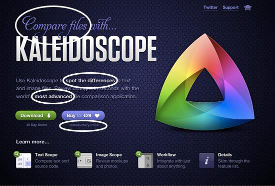
One of the first things you see on the page is the headline "Compare files with Kaleidoscope." This instantly conveys what the app does (compares files) and is reaffirmed by the bolded text in the sub-copy, "spot the differences." This is of course followed by an entire section devoted to each feature of the app. Finally, the value statement is conveyed with the claim that Kaleidoscope is the "world’s most advanced" application of its kind. Even stronger is the statement that the current price is introductory, conveying a sense of urgency to the customer.
To top it all off, let’s think about the site through the eyes of the user. It is attractive so it pulls us in, it’s effective in conveying its message to us about what the app is, but is it functional?
There are three primary things that a user would want to do here:
- Download the app
- Buy the app
- Find out more information about the app
As you can see, both the "Download" and "Buy" buttons are prominently displayed near the top of the site.
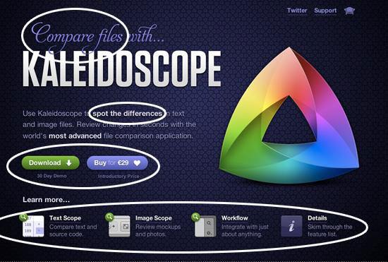
Also notice that the price of the app isn’t hidden (it’s 29 euros) on another page as with many Mac application websites. This is a critical piece of information to the user and the developers aren’t making you work to discover it.
Finally, if the user is unconvinced and wants to know more, the thumbnails at the bottom are quick links to the section of the site corresponding to that feature. Here they find screenshots, video tutorials and detailed explanations so they can be fully informed before making a purchase decision.
Simply put, this is great design. Not because it’s attractive, not because it’s effective, and not because it’s functional — but because it is all three.
The Gist
The difference between good design and great design is not a simple matter of implementing all the right colors, illustrations and effects. Great design is, instead, what results when the perspectives of all of the key players are appropriately considered and reconciled in a synergistic fashion.
Aesthetics, effectiveness and functionality are equally important and together comprise your ultimate goal as a web designer.
No comments:
Post a Comment